


How to Use Just the Right Amount of AI in Gaming T-Shirt Design
- Apr 19
- 4 min read
Filed under: behind the scenes, lessons learned the hard way

Let me save you some time: if your gaming t-shirt design looks like it came out of a Midjourney prompt, your customers can tell. They can always tell.
I run Clutch Co, a CS2-niche apparel brand, and I've spent a lot of hours at the intersection of AI tools and shirt design. Some of it went great. Some of it produced shirts that looked like a stock image generator had a stroke. Here's what I've learned about using AI the right amount — not too much, not zero, just enough to move fast without ending up with designs that scream "printed by a robot at 2am."
Why "AI slop" shows up on t-shirts
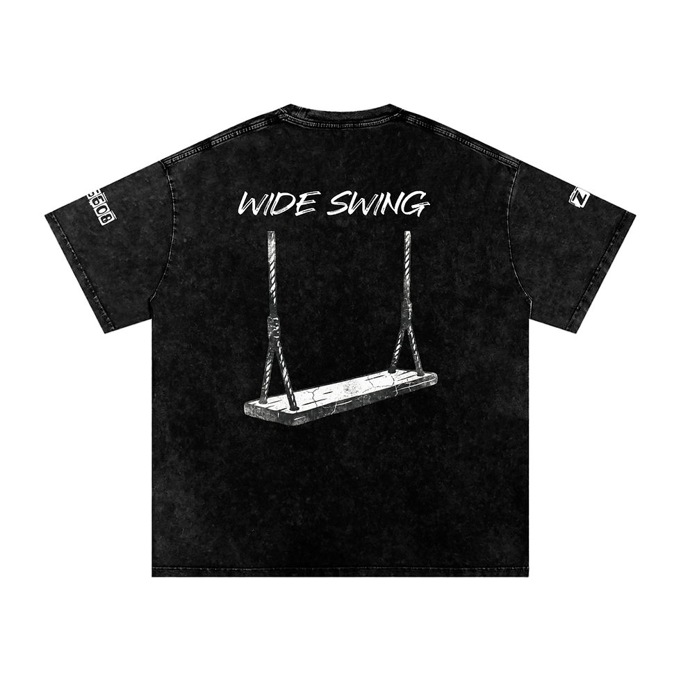
AI image generators are trained to produce images that look like polished digital art. That's the problem. T-shirt graphics aren't polished digital art. They're flat, bold, printable, vector-friendly shapes that hold up at 12 inches across a cotton blend.
When you generate a gaming character in Midjourney and slap it on a tee, you get:
Mushy gradients that don't print clean
Weird hand anatomy (six fingers, anyone?)
Backgrounds that don't belong on a shirt
That specific airbrushed "AI sheen" that people recognize instantly
Text that's somehow both English and completely illegible
The AI aesthetic has become its own visual trope, and it's the opposite of what good gaming merch looks like. Think about the brands you actually wake up and want to wear — they lean into flat, bold, zine-inspired, punk-poster, sticker-pack energy. Not the gradient dreamscape of generative art.
Where AI actually helps
That said, banning AI from your workflow is leaving free leverage on the table. Here's where it earns its keep:
1. Brainstorming concepts Stuck on ideas? Describe your niche to ChatGPT or Claude and ask for 20 shirt concepts. 17 will be trash. 2 will be obvious. 1 will make you sit up. That's a great ratio for a free tool.
2. Rough reference imagery Need to see what a "cyberpunk Counter-Strike operative" might vaguely look like before you sketch? AI gets you 80% there in 30 seconds. You're not shipping the image. You're using it as mood.
3. Text and copy Product descriptions, blog posts, tagline drafts, SEO meta descriptions — AI is genuinely excellent at this and doesn't leave a fingerprint.
4. Cleaning up and isolating elements Background removal, upscaling, converting to vector — AI-powered tools handle the grunt work you'd otherwise pay for or do manually.
Where AI wrecks your designs
1. Final artwork Don't print what Midjourney gives you. Ever. I don't care how clean it looks in the preview. It will look like AI on the shirt because it is AI on the shirt.
2. Anything with characters or hands Gaming merch is full of weapons, hands, faces, logos. AI gets all of these wrong in subtle ways that your eye catches but can't quite name.
3. Typography AI-generated text is still mostly gibberish. You need real fonts, placed by you, kerned by a human.
4. Anything you want to feel authentic The whole point of niche gaming apparel is that it feels like it was made by someone who gets the culture. AI doesn't get the culture. It generates what the internet thinks the culture looks like, which is always one step behind and slightly wrong.
The workflow that actually works
Here's the setup I've landed on after a lot of trial and error:
Step 1: Concept in AI, refine in a brain Use AI to throw ideas against the wall. Pick one. Then think about what you would do with it that the AI wouldn't.
Step 2: Generate reference, not final art If you use AI imagery at all, treat it like a Pinterest board. Mood, composition, color — not the finished piece.
Step 3: Redraw, trace, or build from scratch in real design tools Kittl, Figma, Illustrator, Procreate. Real design software with real vector assets, real fonts, real human decisions about what stays and what goes. This is the step that separates your brand from the AI t-shirt dropshippers flooding Etsy.
Step 4: Use flat, bold, limited color palettes AI loves gradients and 47 shades of teal. Resist this. Two or three colors, high contrast, clean cutouts. It prints better and looks more intentional.
Step 5: Ship designs that have a joke, a reference, or a point of view The thing AI cannot replicate is a take. A design that references a specific in-game moment, a community meme, a shared frustration — that's what your customers are paying for. AI can't feel the AWP crutch pain. You can.
The "detectable AI" test
Before you print anything, ask yourself: if a customer posted this design in a subreddit for your niche, would the top comment be "this is AI"?
If yes, rework it. The community sniff test is brutal but accurate, and gaming communities especially have become very good at spotting AI art. Getting roasted as "AI slop" in front of your target market is a brand wound that doesn't heal fast.
The honest middle ground
Using AI in 2026 is like using Photoshop in 2005 — everyone is doing it, the people who pretend they aren't are lying, and the winners are the ones using it as part of their process instead of as their process.
The rule I use: AI is a tool in the workshop, not the craftsman. It can help me brainstorm, write, edit, reference, and speed up the boring parts. It cannot be the one making the actual design decisions my customers are paying for.
Use it for the 80% that doesn't matter. Do the 20% that does — yourself.
Running a gaming apparel brand and figuring this stuff out as you go? Check out Clutch Co for more behind-the-scenes posts, or shop the CS2 collection to see how we apply all this in practice.


Comments